The research phase of this project involved shadowing people through the gallery and noting any issues they experienced.
I paid special attention to the following:
At the end of the observation phase I surveyed visitors leaving the gallery to gather their opinions.
Although I observed some issues in the interaction between the users and the gallery, all visitors said they were very satisfied after their visit and claimed they had no issues.
(Trust what users do, not what users say!)
Surveyed visitors didn't have any feedback regarding improvements to the gallery. Most were happy just wandering around, which means that the solution for those who want more direction shouldn't be invasive and be available only for those who require it.
A special mode for time-limited users could be produced that creates a custom route based upon their interests and time available.

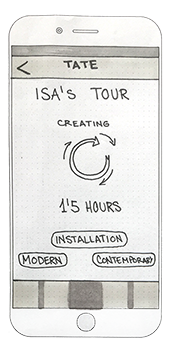
The personalised tour will need some time to load. This screen will work as a confirmation of the options selected by the user.

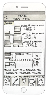
The apps offers an overview of the levels that will be visited and gives the user the option of make changes.

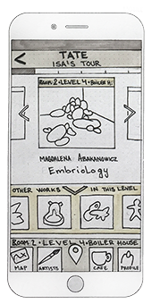
The works that are part of the tour are presented in the same order as they appear on the route.
Other works that are not part of the tour are also shown in case the user wants to know more about them.

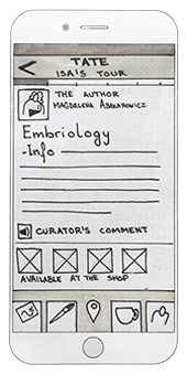
Clicking on a work shows more information about the artist, close up pictures, curator's comments and availability of souvenirs in the shops.
“Observing the user in context allows the designer to identify issues that may not seem obvious, but exist nonetheless.”