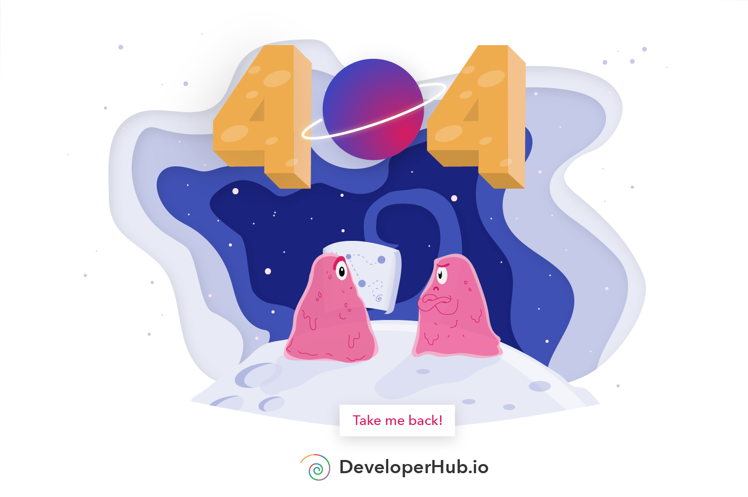
Developerhub was my first experience of joining an existing product. I worked on a number of different projects, including: improving the navigation on mobile; redesign of the sign up/log in page; history view feature; illustrations for the 404 and 403 page; and a number of promotional images.
Our users were technology companies (referred to as "writers") that needed to make documentation available to their users ("readers").
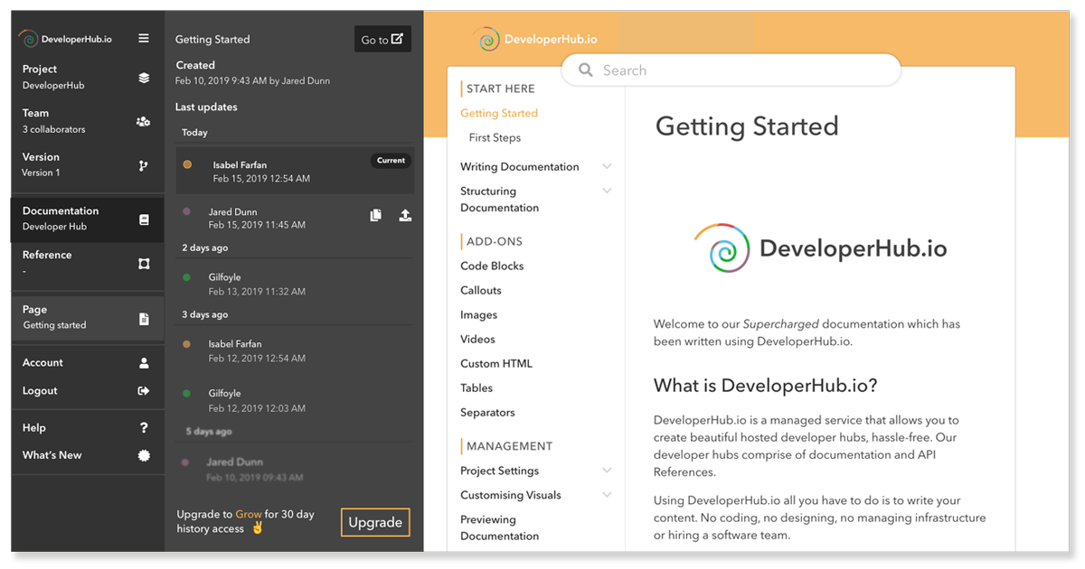
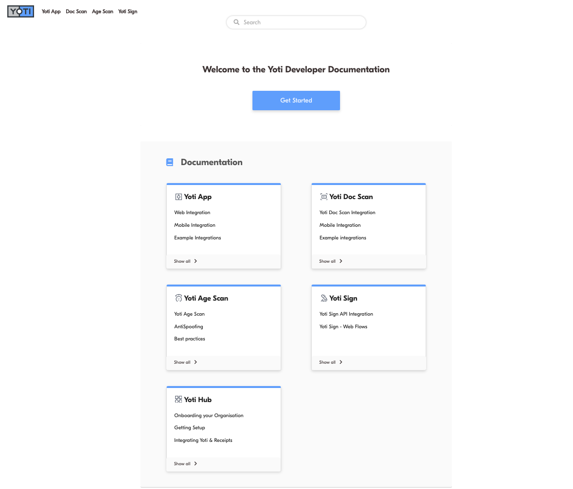
I worked on the autogenerated landing page from ideation to delivery.
The objective was to provide readers with a modern and smart entry point where they could explore their documentation easily.
The challenge was to not create any extra work for the writers, for the landing page to adapt automatically to the content, and for it to auto-generate according to the structure of the documentation.

Headers, text, buttons, cards, formatting, links, etc
Versions, user guides, references, pages, subpages, etc
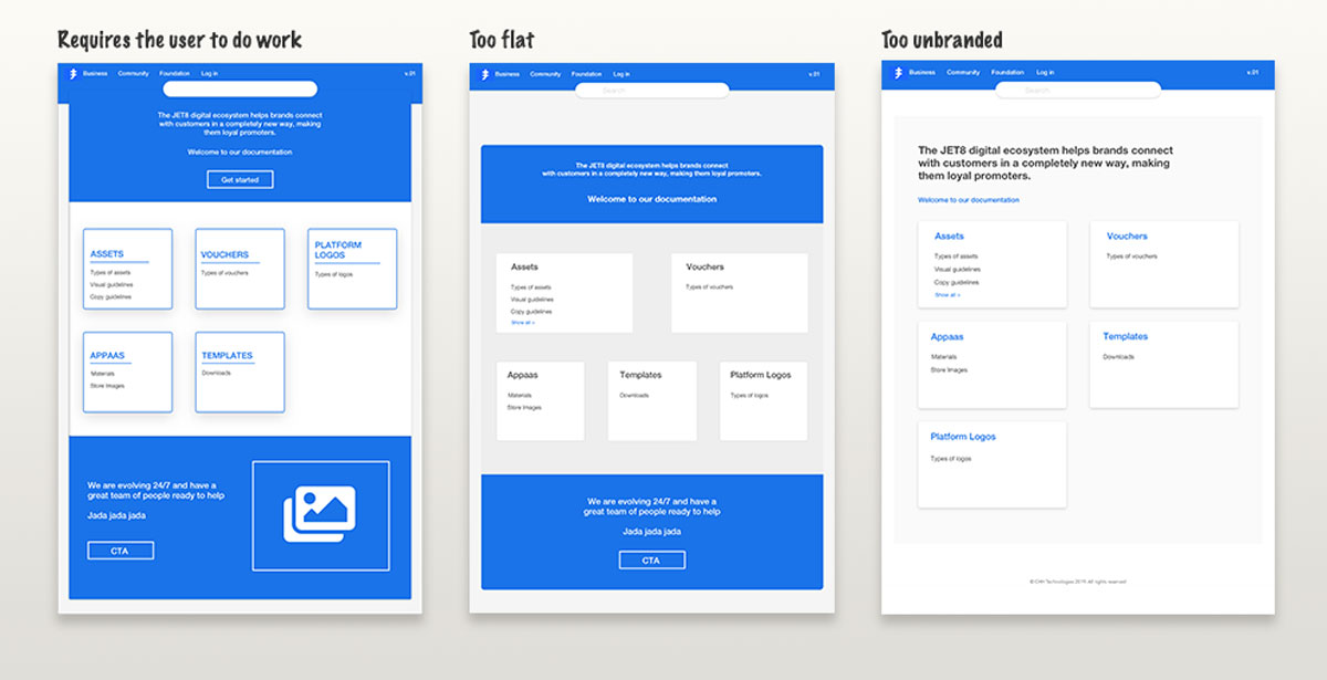
By establishing a hierarchy and defining maximum number of options per card.
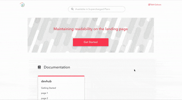
Main/link colour combinations, accesibility rules, establish parameters for colour changes.
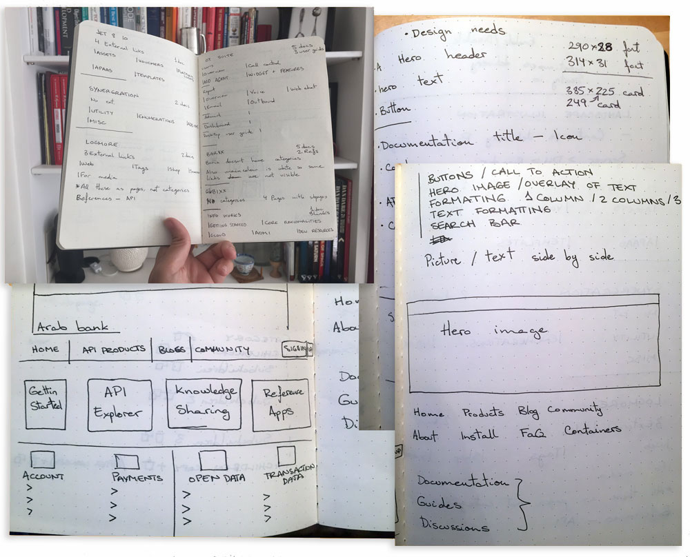
Iterate rapidly - gather ideas through quick sketches.
Solve once, extend to many.
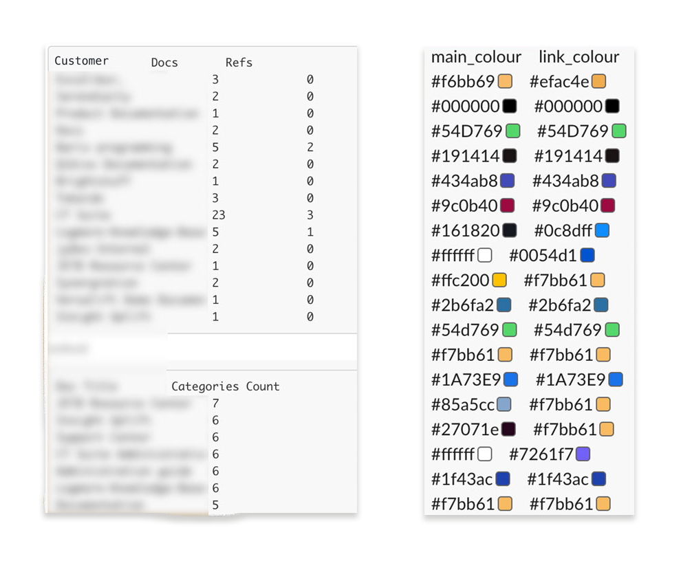
The problem: with increased flexibility comes increased variation.
Documentation was organised by reference, title, version, category, page and subpage. Some used categories as pages and pages as subpages, others used versions as different docs - everyone had their own method!
For the colours the situation was similarly inconsistent. Some users used the same (or similar) colours for both text and links, others used white for main colours (which looked transparent), others used black for both their colours.
I whiteboarded several layouts and wireframes, and once I had a clearer idea of the way things should be organised I started to iterate the design of the page.
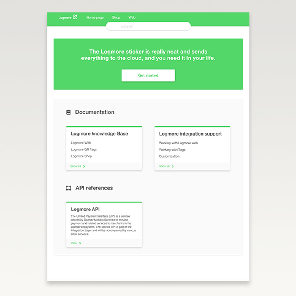
Using a customer with a brighter palette as a base, I experimented with different images, icons and calls-to-action.
My main objective was to allow clients to have a good-looking landing page without needing them to do any additional work.
Before building we shared the design with some of our users.
We selected users with a range of use-cases from simple to highly complex to ensure the design met the criteria.
Once we had validated the page design we started on other details such as how to personalise the page, how the interactions should behave, and how it'll integrate into the dashboard.
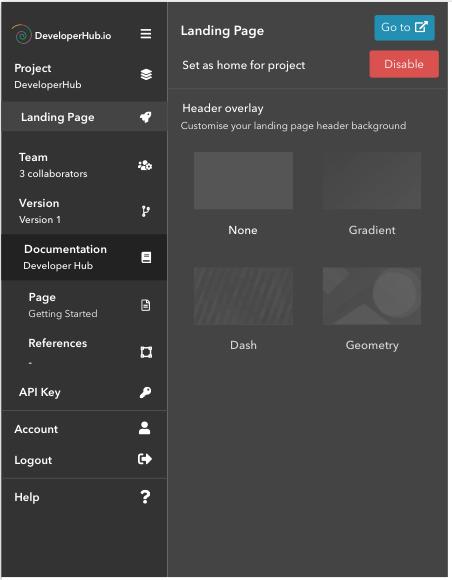
The landing page submenu allows for further customisation of the Landing Page by allowing users to choose an overlay for their hero image
Writers also have to option of disabling the landing page if they wish
The hero text can be changed directly on the page, and they can also add buttons and links if desired.


“It is possible to achieve a lot with very little. We were a team of two, working remotely, delivering work alongside other personal projects. Shipping our improvements and new features each week felt like a win every time.”